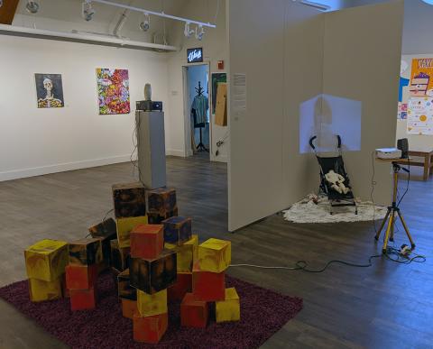
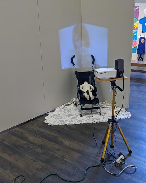
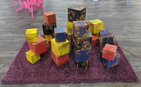
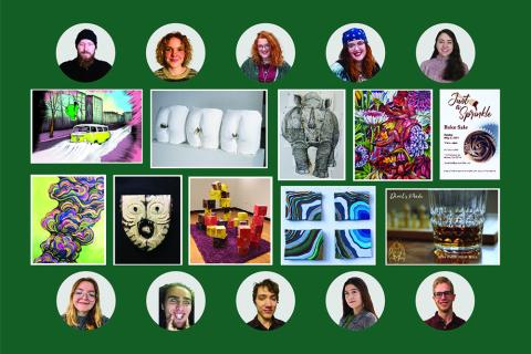
The annual BFA capstone exhibition features the work, passion, and educational journey by PSU senior students. Graphic Design, Multi Media, and Studio student artists working in a variety of mediums spend the academic year exploring and assembling a collection of works, personal to their interests.
Exhibition Walk-through
Exhibition Opening Celebration
Friday, April 9, 7-7:45pm.
ARTalk
Tuesday April 20, 7-8:15pm.
Concentrations

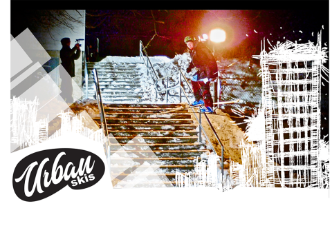
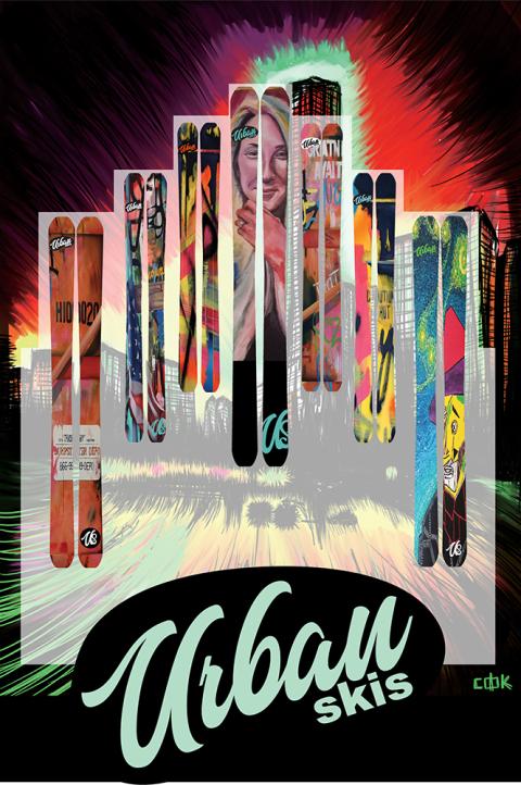
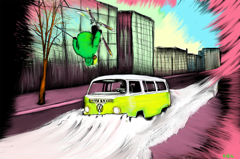
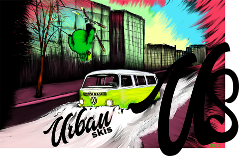
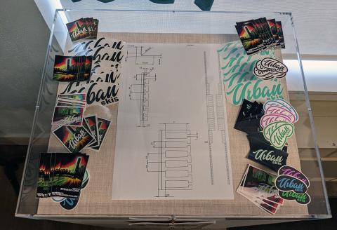
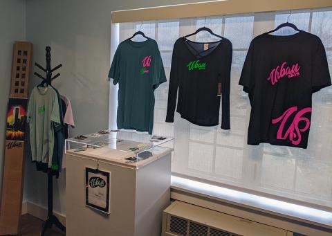
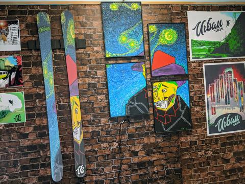
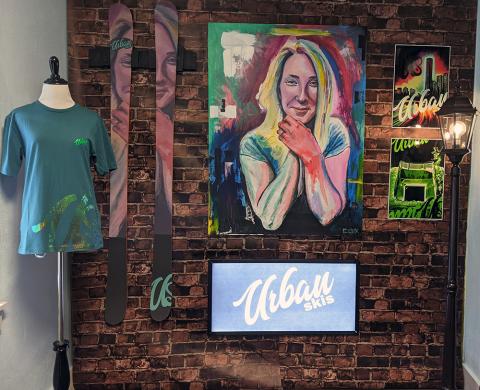
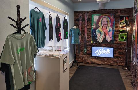
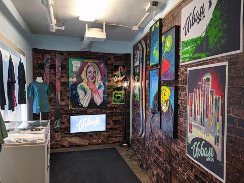
Spenser Cook
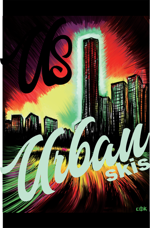
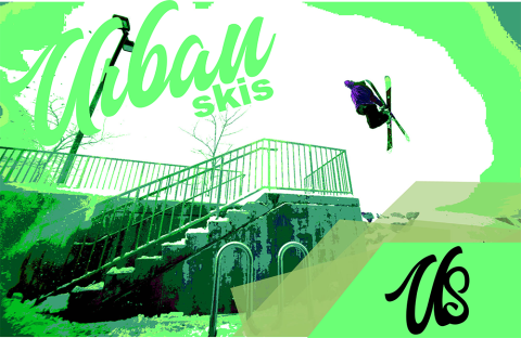
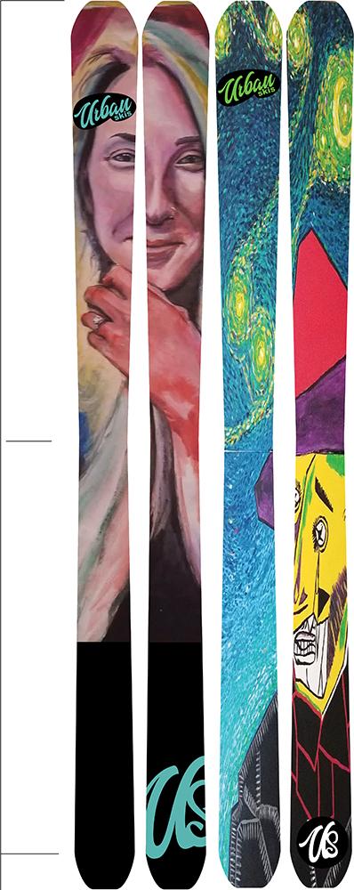
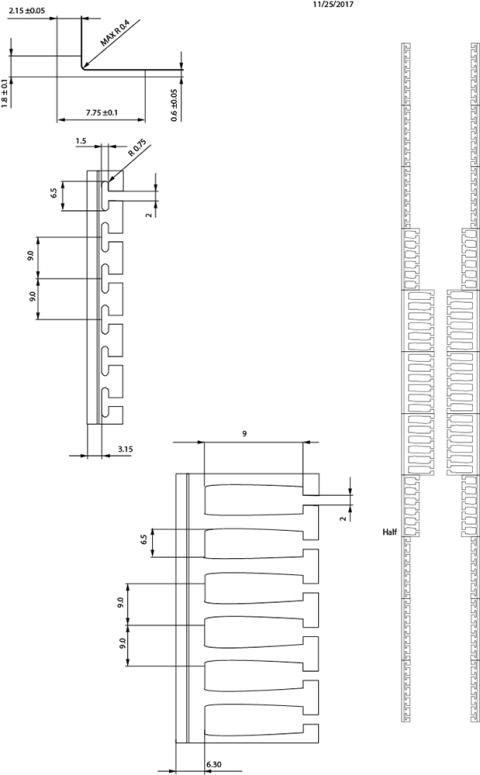
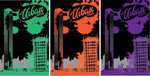
Artist Statement - Urban Skis is a new type of ski company. For decades skiing has been marketed towards expensive resorts with equipment costing thousands of dollars. With Urban Skis, the industry will finally have a product/ company who caters to urban skiing and the lifestyle around it, made for skiers, by skiers. No more destroying thousands of dollars of equipment hitting urban. Affordable, durable, equipment made for the streets and meant to take a beating.

Bryana Reardon
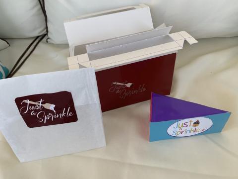
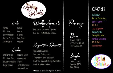
My name is Bryana Reardon. I am from Uxbridge, Massachusetts where I have lived and grown up all my life. Coming to PSU was a great change in scenery with all the mountains since I live mostly on farm land. I really enjoyed my time here at PSU as a Graphic Design major because I met so many amazing and talented friends along my way as well as professors who helped me improve my work. My work is simply with pops of color here and there. I also have a very geometric style to my work that includes a lot of line work. One thing I want to tell younger artists that I have learned from my time as an artist is always be open to critiques, sometimes it may sound harsh but it really is eye opening and helps open up your eyes to new ideas. My goal is to one day become a graphic designer advertiser for all sorts of companies, hopefully I can showcase a baking company in my future. I hope you enjoy my bakery company and opens you up to love for baking as well as make you hungry!
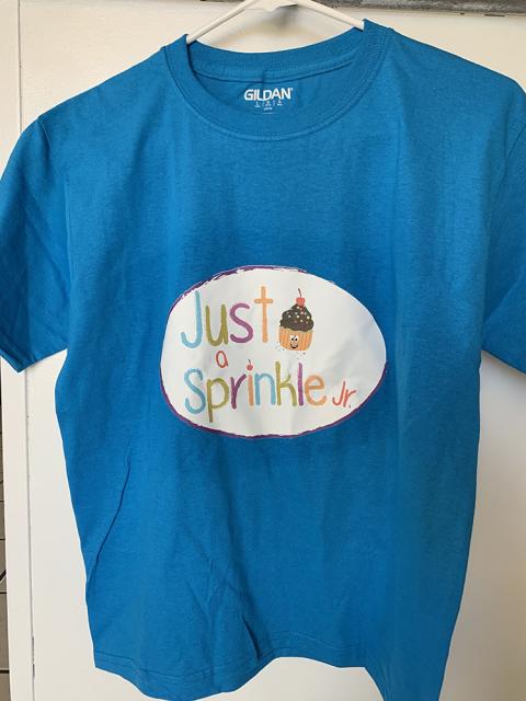
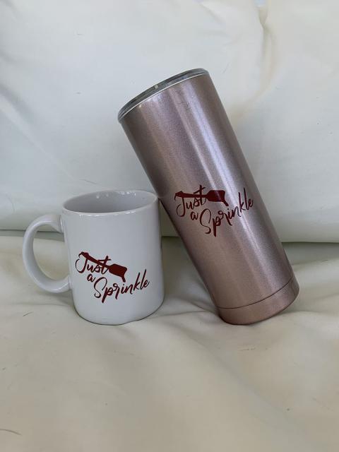
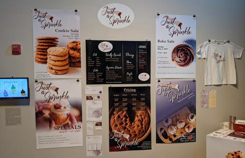
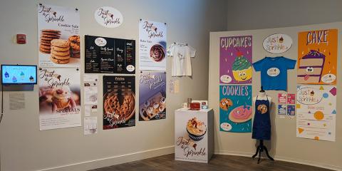
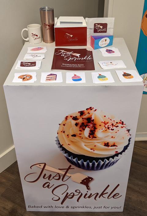
Artist Statement - For my thesis, I decided to create a bakery called Just a Sprinkle located in Boston Massachusetts. The idea that came to be of Just a Sprinkle originated from my mother who is a baker and loves to bake all sorts of desserts. She doesn’t have a bakery, but I decided to create this, in relating to her hobbies and what her and I love to do when we are together. My plan is to create a bakery that sells cake, cupcakes and cookies. There will be an adult side bakery that has more sophisticated flavors, and there is a fun kid side of the bakery that has flavors that kids enjoy. Besides desserts, there will also be birthday parties, baking classes, bake sales, t-shirts, baking utensils and other fun stuff for purchase and availability.
Nathan Simmons
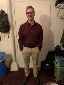
My name is Nathan Simmons. I am 21 years old, and I am from Cape Cod, MA. I have been taking graphic design classes since I was a sophomore in high school. Ever since then I have loved taking design classes and decided to follow path even further in the BFA program.
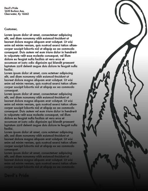
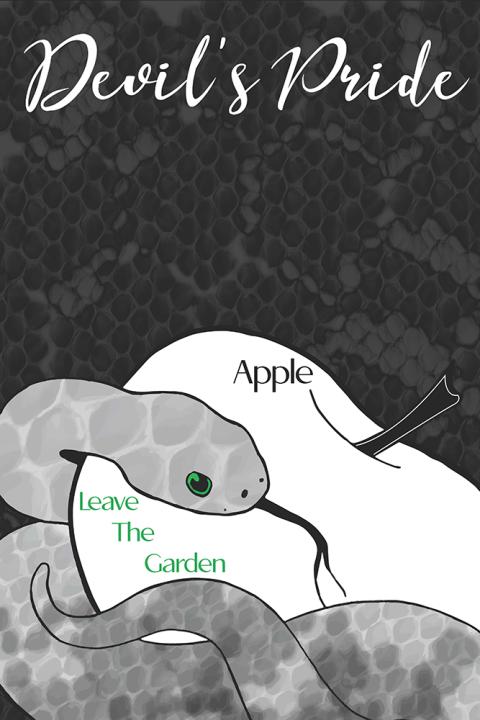
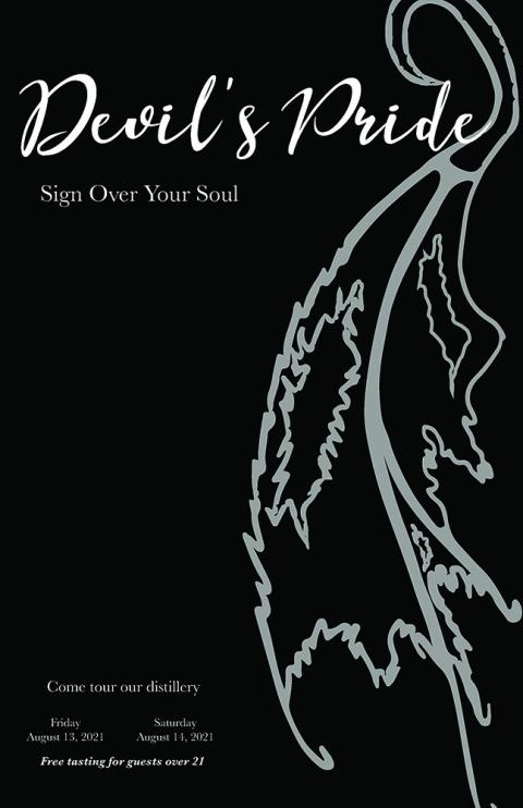
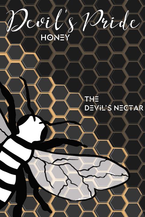
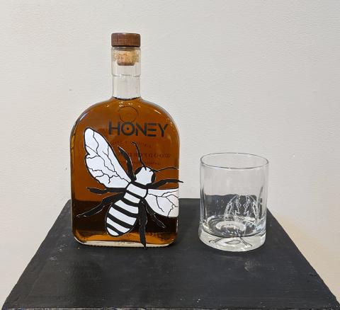
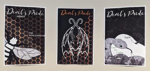
Mission Statement - This project was to create our own company from scratch and design all of the products, posters, websites, letterheads, packaging, and much more. I created Devil’s Pride which is a whiskey company that is based out of Kentucky. Devil’s Pride is a smaller distillery, but yet still rivals may of the larger companies by creating the best whiskey experience that one can buy. Devil’s Pride is dedicated to providing you with not just a drink, but yet an experience. Everything starts by just looking at our bottle the dark, but elegant looking designs makes you want to keep looking. The smooth, but rich flavors of our whiskey have never been matched.
Callie Dawson
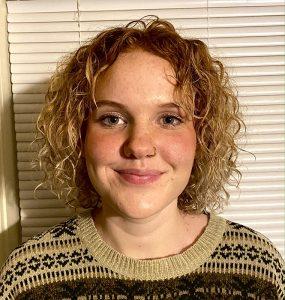
I am from Northfield, NH and I’m soon to be a Plymouth State graduate with a bachelor in fine arts multimedia degree. As this time here comes to an end I realize just how much I’ve learned about myself with the art that I make and I finally feel like I have some sort of direction. As an artist I’ve learned that I really enjoy the reactions between people and art. In my art I combine themes to make the viewer think. I want them to have to wonder where the thought of combining such things came from. I like when people see my art and can’t help but to have an expressive reaction, but sometimes the viewer doesn’t have a physical reaction that is visible and that’s okay with me too, whether they are shocked or not is not really my focus anymore, because shock is such a vague term. Whether they’re shocked, uncomfortable, or completely intrigued, I want to show them something that has always been there but has never been recognized. I’ve met a lot of great artists here at Plymouth and learned a lot of new stuff and without that I wouldn’t be the artist I’ve become.
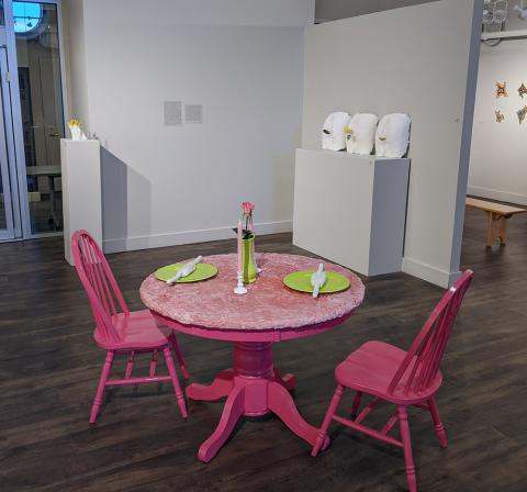
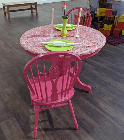
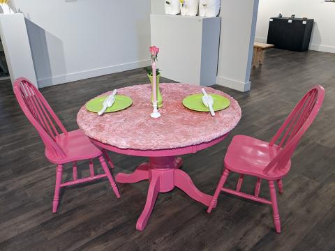
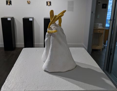
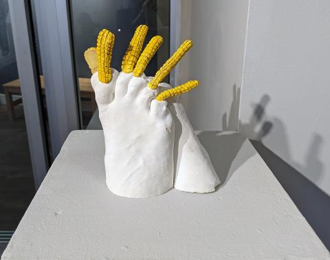
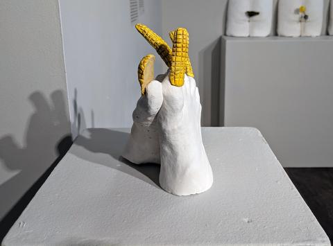
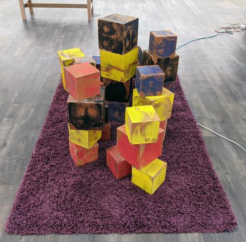
Artist Statement - I want to show the viewer something that has always been there but has gone unnoticed. I do this by making combinations of real elements that don’t typically go together. These pieces of mine look recognizable and could be real, but they are so contradicting of each other that no one would ever think of it. I come up with not just things you wouldn’t think of but things you would not want to think of. Combinations that you would probably never want to pair with each other. Plaster is the medium that I typically work while. Plaster has a lot of room for manipulation and there are many different ways of making forms with it. In a few of my pieces I made the main subject out of plaster and kept it the original white color and then had the more exaggerated part in color. By exaggerated I mean the part that was unexpected: the yellow corn toenails on two white plaster feet, the white plaster butts with a green pickle, yellow flower, and an orange cheese ball coming out. I’ve found that this is something that can make the piece stronger, by just adding accents of color on the parts that I want to be recognized the most. What I’d like for the viewer is for them to see this configuration of themes that I’ve come up with and have this humorous feeling.
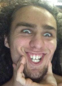
Pine Hakopian
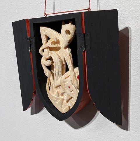
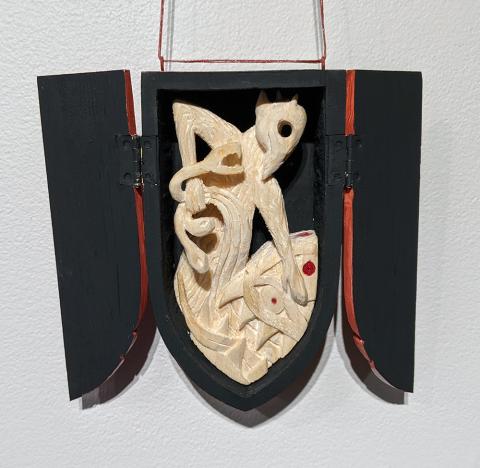
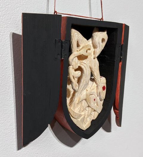
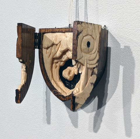
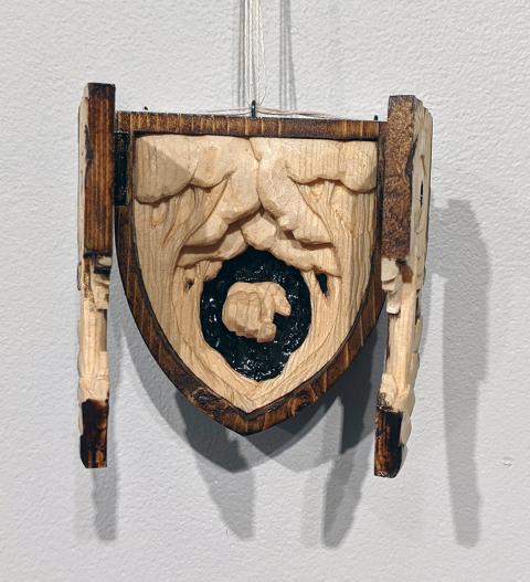
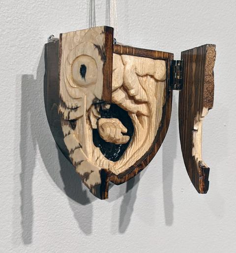
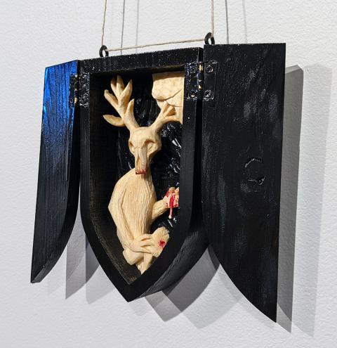
I am interested in exploring experiences and how they can come forward into art. I enjoy where I am artistically because the work I am creating has an intimate feel to it with its size, needing to be up close to see all the details. That is what I hope every viewer does, get up close to a piece and think about it. After I graduate, I hope to continue to push the limits of detail in my work on smaller and smaller scales.
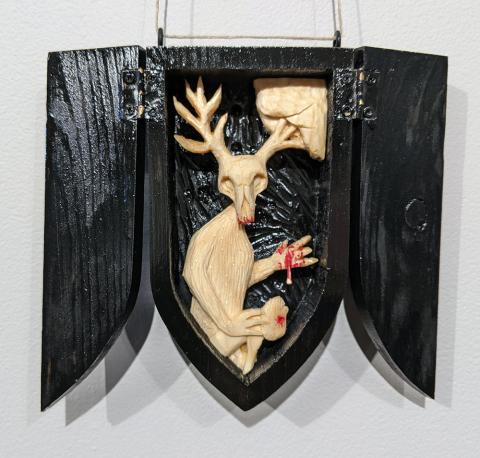
Artist Statement - My art explores racial violence, PTSD, cultural displacement, the environment and how those are interconnected and related.
Racial violence and PTSD have come from years of witnessing and experiencing violence due to me and others being of Middle Eastern descent. I am expressing these ideas as an artist to vent them, as an outlet for that energy, and also so the viewer is made aware that racism is not a thing of the past and is still alive and present.
Although I did not intend to make art about Racial violence and PTSD, it was an accidental bleed into the art I make. The racial violence my family and I face is such a forefront in my brain that it should have been foreseeable that it would come through in my art. The change though, is that instead of pushing the influence of PTSD back from my art, I have embraced it and allowed it to be the inspiration instead of repressing it, and now it is the spearhead of my creation.
The theme of cultural displacement is linked to racism from being of Middle Eastern descent, however, it is its own separate theme due to the fact that I am mixed; half Middle Eastern and half White. This has caused a mix of cultures that has put me firmly outside the canon of both of the cultures’ centers.
The environment as a concept for me stems from it being a place of emotional escape during the years of violence as well as a safe place during the actual acts of violence. This means it has been closely intertwined in my family and my emotional well being as well as physical safety. Another role the environment has in my art, that may not be noticeable, is that I am keenly aware of the environmental impact of always buying new materials, and thus avoid it. I use 99% recycled material. That way I am keeping waste out of the environment, and any waste I create is less then what had been originally. My art should not have a negative environmental impact.
My art explores four basic points. The first being racial violence, and the effects it has on those impacted by it. Second is PTSD, and how it can infect every aspect of the victim’s life. Third is cultural displacement, and how it can place a person on the outside of two worlds which leaves them completely alone. Lastly is the environment, and how it can help and affect the healing and survival of those around it.
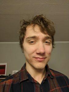
Andrew Heath
Andrew Heath is a native NewHampshirite living in the Concord Area. Before coming to art, he first worked as a violin maker in Maine, where he gained an appreciation for fine craft and the history behind the profession. While attending NHTI, he fell into making fine art and teaching, which set him off on his goals of becoming and educator and fine artist. When not making art, he is working on helping the community of Concord through their Maker Space, Making Matters.
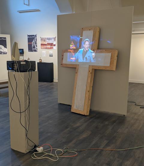
Artist Statement -The work I make attempts to make critical points about societal forces, and offers an exploration between the individual and the social machine. It seems that too often we are asked to make shallow observations about the deeply complex world we live in, and these shallow observations can cloud the deeper connections in front of us. I hope to encourage viewers to look past those shallow observations and into the deeper complexities of the social machine.
I make my artwork using any object, material, and media that best serves the message of the piece. Through the familiarity of the material I use and the objects that I produce, I hope to make the work and ideas more accessible to viewers who are subjected to the outcomes of the social machine.
The artwork I produce is not meant to be the end, but the beginning of exposing the deeper complexities of the social machine. The work doesn’t try to provide answers, and while I might not hide my personal views, it is in an attempt to invite questions and discussion, asking for a deeper consideration in what we hold true and are asked to believe.
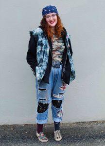
Gwendolyn Hoyt
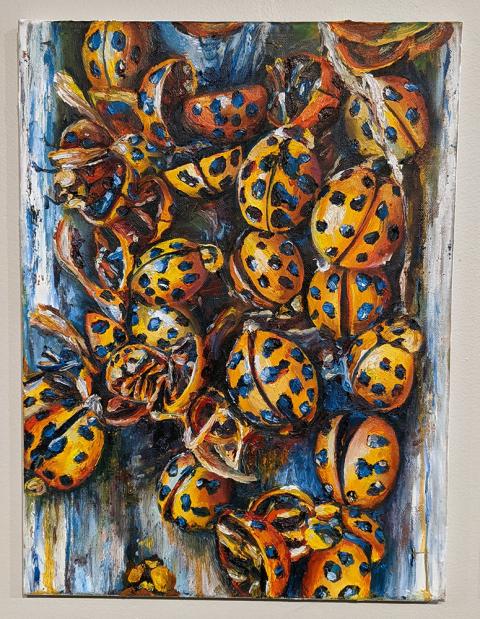
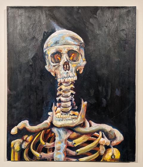
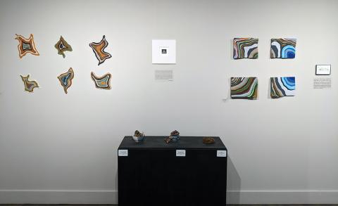
I live in Holderness, New Hampshire and I will be graduating this Spring with a BFA in Studio Art with a focus in painting. I’ve always had an interest in things which weren’t typically considered beautiful. Bugs, bones, and worms have been a part of my life for a while so it’s not surprising for me to see these subjects as the focus in my paintings these past few years. My artwork still begins to expand and more so now I’m transitioning to pieces which solely focus on beautiful compositions rather than works which disturb the viewer.
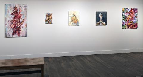
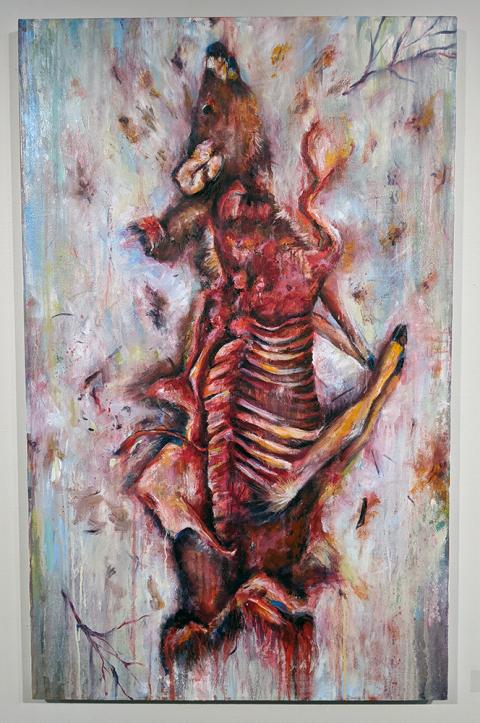
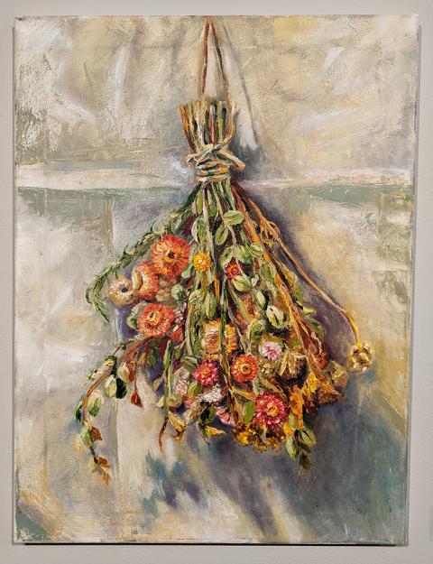
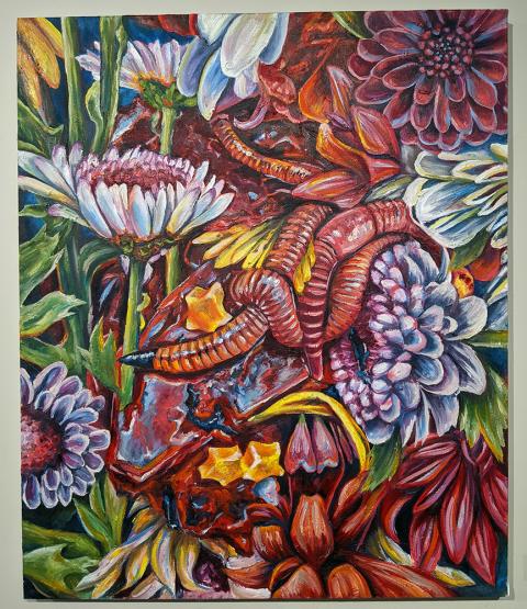
Artist Statement - I’ve always been interested in the contrast between life and death, and it’s been the focus of my art for a long time. I’ve briefly explored these themes in the past and it wasn’t until this year that my work using these concepts took off. I love painting with oils specifically painting things from life and from images of compositions which I arrange myself. I use subject matters found in nature from bones that I found in my backyard, bugs that I found on window sills, and worms that I bought from the store. I’ve enjoyed experimenting with contradictory elements like worms and flowers to solely focusing on the beautiful or the bloody. I’ve also experimented a lot with brushstroke and alternating processes. I found that flip flopping between tight, controlled mark making to looser, more painterly works is more exciting and refreshing for me. I play around a lot with saturated color because I think color brings out the beauty in even the most disturbing things.
Painting more grotesque subjects is most interesting to me because it allows me to create work which challenges the viewers opinion on what traditional beauty is. My work has gone through many phases but all tie into the general concept surrounding life and death, and the beauty within both. Death is equally as beautiful as life and my focus is to portray these different kinds of beauty in my art through a range of subjects, brushstrokes, and color palettes.

Ursula Hoyt
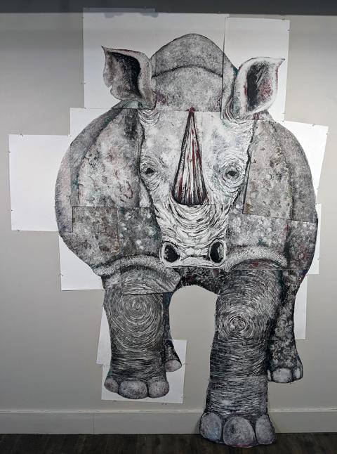
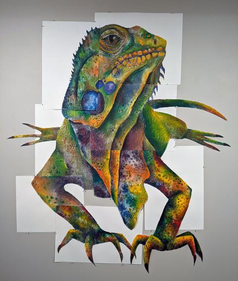
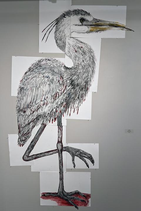
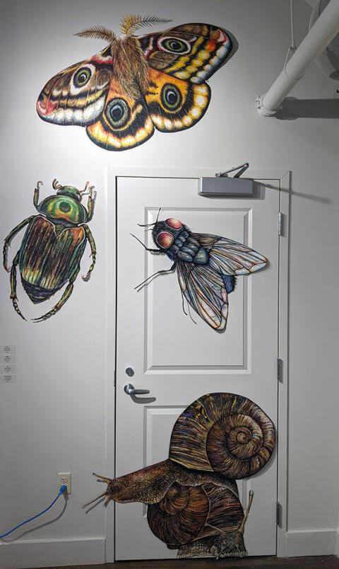
My name is Ursula Hoyt from Holderness, NH and I am completing a BFA degree in Studio art with a focus in printmaking. While at PSU I have further developed my skills in a variety of different printmaking techniques, specifically monotypes, while also experimenting in many different mediums including drawing, painting, and ceramics. I have always been drawn to bright, saturated color while also finding inspiration through nature and incorporating that into my work.
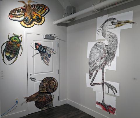
Artist Statement - My current body of work focuses around my connection to the creatures that walk amongst us. I’ve always felt a deeper relationship to animals and insects than I have for people. Specifically the raven, with whom I have had spiritual experiences revolving around them, which led me to believe the raven is one of my spirit animals. I have always loved how they are so free yet so mysterious and their tendency to go unnoticed. Ravens are typically the type of animal overlooked for their beauty because they aren’t the most eye catching, or because they prey on roadkill, or even because, as some say, they have a demonic aura to them. But I have always seen them as so much more. I feel like humans have created such an authority for themselves that we forget that we live among other creatures that deserve to be here just as much as we do. I believe part of the problem has to do with the fact that people are physically bigger than most of the creatures we coexist with, which influences how we treat them. Humanity as a whole treats creatures as though they aren’t worthy of respect or decency. In general, we walk along this earth with no care about our influence on it, which in turn reflects in the lives of the animals we live around. Everyday there are animals being hit by cars, habitats being ripped apart for new stores, and insects being crushed under our feet, yet our lives go on and their lives end. I created a series of giant creatures in the hopes of creating the illusion that humans are small in comparison. By making the animals and insects so big I wanted to give them the superiority that we possess on a regular basis.
Isabella Miller-White
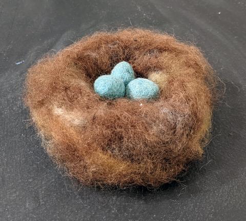
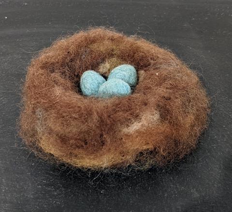
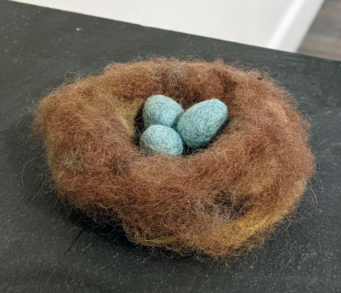
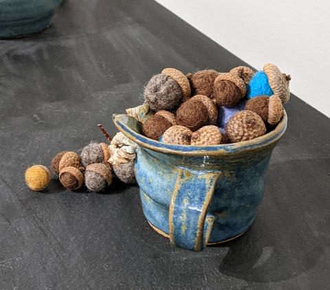
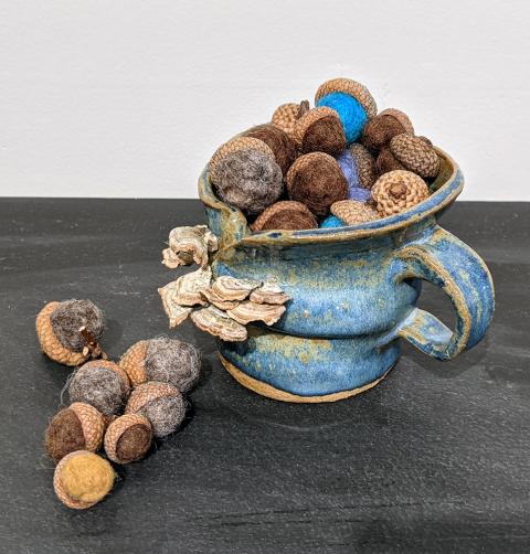
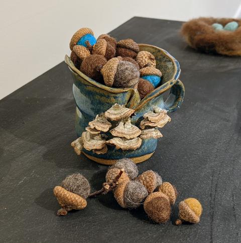
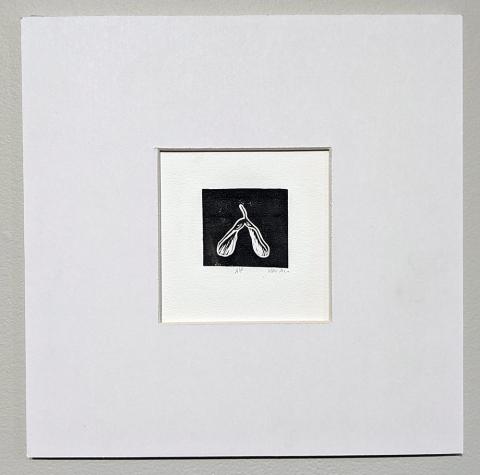
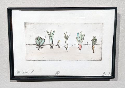
Isa is a BFA student with a concentration in printmaking. As a New Hampshire native, she is heavily influenced by the natural world, and this semester she has explored her own personal relationship with the local environment. She tends to work intimately, with small observational pieces. Isa began her journey at PSU primarily interested in printmaking but has expanded her practice to include watercolor illustration, photography, and felting. After completing her undergraduate degree she hopes to explore a career in education.
Artist Statement - Working with my hands has been an enormous draw of mine since I can remember and is likely the driving factor that fostered my love for art-making. I was very fortunate to have the unique opportunity to attend a farm school, Woodland Community school, in its first few years taking off, from kindergarten to fourth grade. Those years I spend on the grounds of Meadowstone farm have been a primary influence for not just my art, but my system of beliefs and my own self aspirations. This unique academic experience early on layed the foundation for the life I wanted to lead and ended up being the basis for my art-making practice. I’ve always known how strong my interest in the outdoors is, however through my practice I’ve made it apart of my life in a more meaningful way.
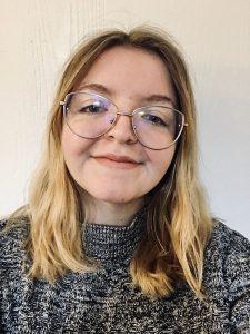
Kassie Stanley
Kassie Stanley is a painter and illustrator who grew up in small town Holden, Maine and became infinitely fascinated with the beauty of nature at a young age. She came to PSU originally for their exceptional art education program but decided she couldn’t stay away from her passion for painting. In her time at PSU, her work has become increasingly more abstract, and she has grown as an artist and person in many ways. With every painting she explores her own relationship with color and respect for the natural world. Her work is moving toward a focus in conservation by calling out the destruction of habitats. She hopes that visitors of this exhibit can appreciate the artistic qualities of her work while understanding that it is a representation of destruction of the natural world.
Artist Statement - Kassie Stanley is a painter and illustrator who has a love for nature. She grew up on a small farm in central Maine but has lived in rural New Hampshire and Boston, Massachusetts for brief periods as well. Her artwork has a strong focus on linear elements and bright colors, usually with subjects related to conservation. Her work is done in both traditional and digital mediums. Kassie works primarily from photos to create still life-esque abstract paintings of natural subjects, often in series.
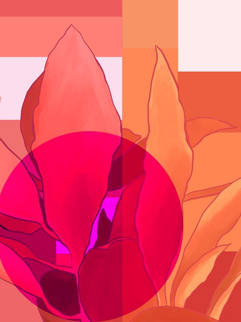
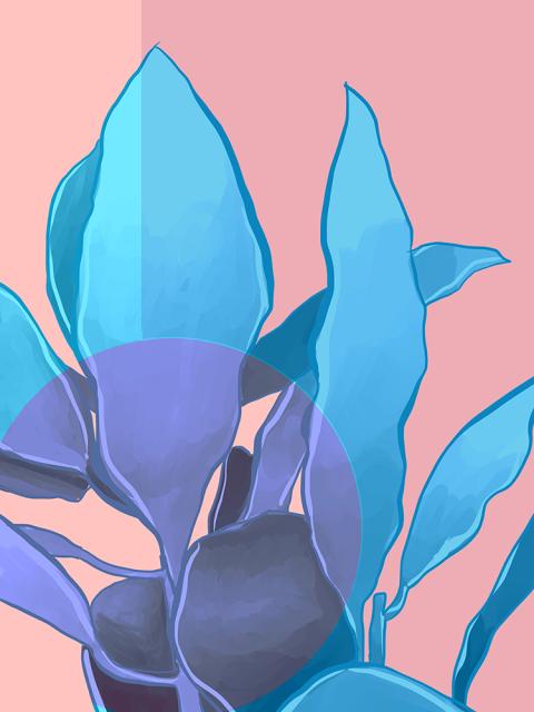
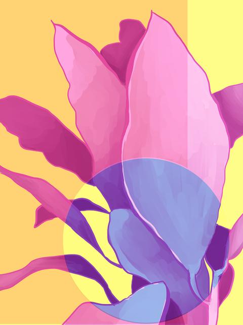
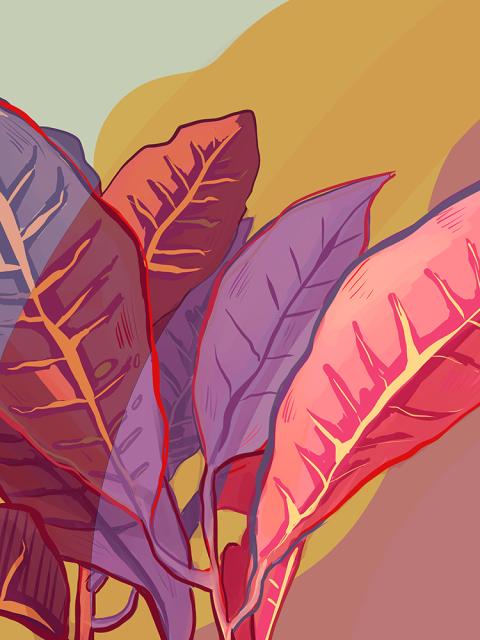
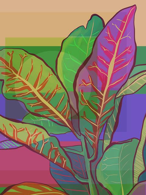
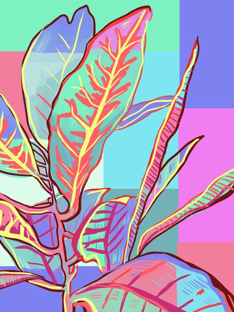
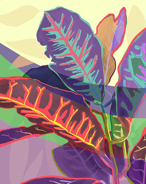
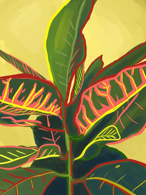
Kassie’s Thesis revolves around the dissonance of how humans interact with nature, namely the personal relationships we have with domesticated houseplants as opposed to the reckless ways we treat our environment. Exemplified in the two series she presents – California Wildfire Smoke, an acrylic painted series about the dangerous wildfires that occurred in 2020, and Wesley, a digital art series of her Croton Petra houseplant whom she’s fondly named the moniker. Her work raises important dialogue about the way we treat the things we claim to love, and emphasize the feeling of helplessness that seeing such destruction creates, even as corporations beautify it as progress. The artworks in these series attempt to exemplify a world too colorful to destroy.


